Invigorating spaces to motivate healthy living.
A common theme in recent fitness center design has been bringing the outdoors in by adding elements of nature to indoor spaces. The projects shown took over a month to complete due to client approval processes. I also worked directly with the print vendor and installers to choose materials, attend press checks, and oversee installs.

For this corporate fitness center in San Francisco, I worked with the building's designers to ensure that our color palettes matched their vision. The client requested fitness photos for member motivation. (Site photo 1 of 2)

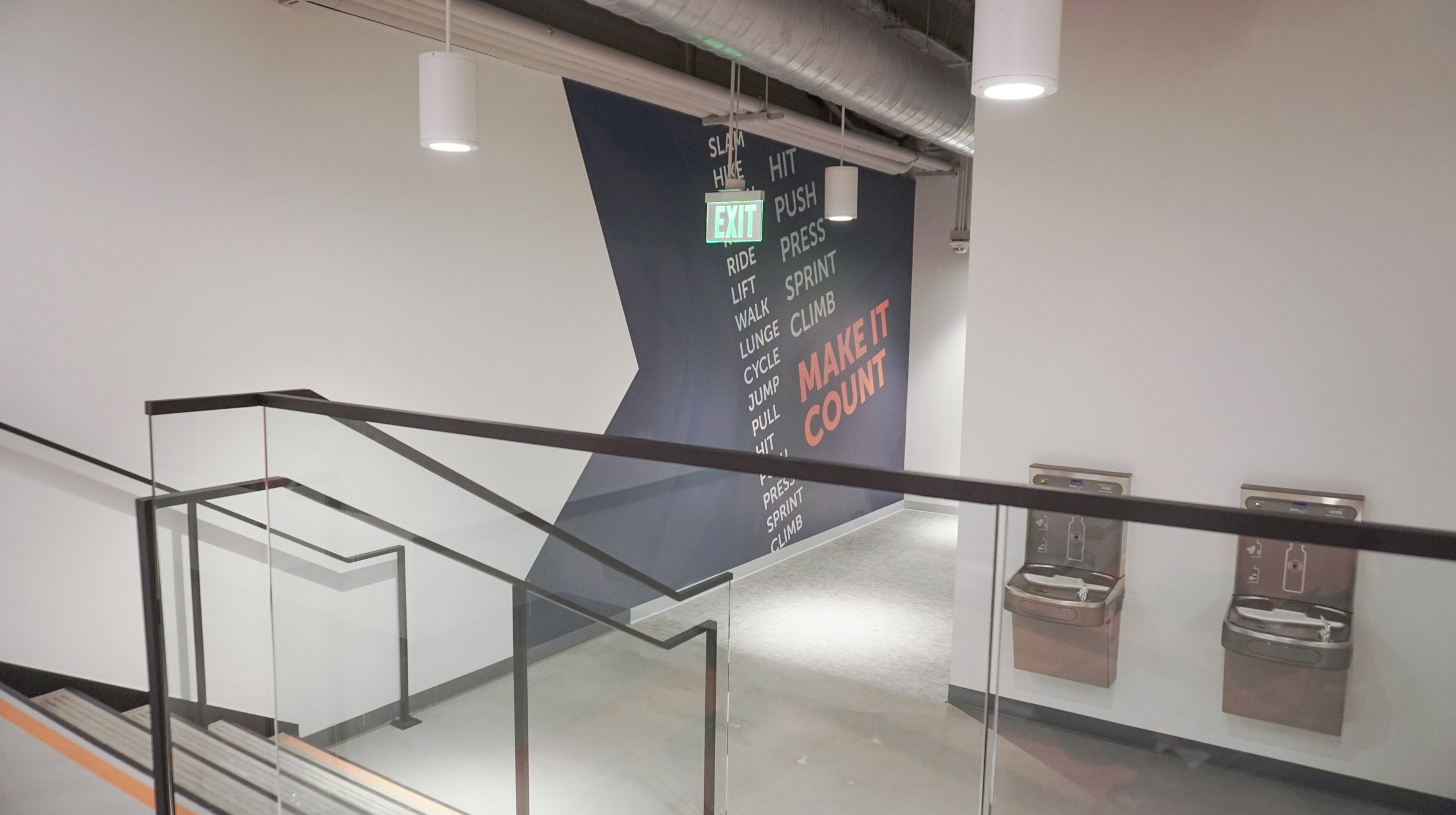
A word wall was requested by the client to help motivate members as they enter and exit the fitness center. I thought of all the different movements that occur in the gym, and to drive purpose behind each move. (Site photo 2 of 2)

This 19' curved wall welcomes members on their way to the locker rooms. The graphic focuses on Oakland's diverse and active community. The red ribbon is a unifying element used throughout the club.

A big challenge I faced with this project was that the client was apprehensive about large wall graphics. With some persistence and several design iterations, the medical fitness client approved the design and even approved covering the door!

I worked closely with KINETIC's marketing department to ensure my designs were executed according to their strict brand guidelines. The copy and photos were my choices, while the photo treatment was part of their style guide. (site photo 1 of 2)

KINETIC didn't want to use standard gender icons for the locker room, so we came to the decision to use imagery in line their style guide. When viewing head on, the horizons vertically align in the center. (site photo 2 of 2)

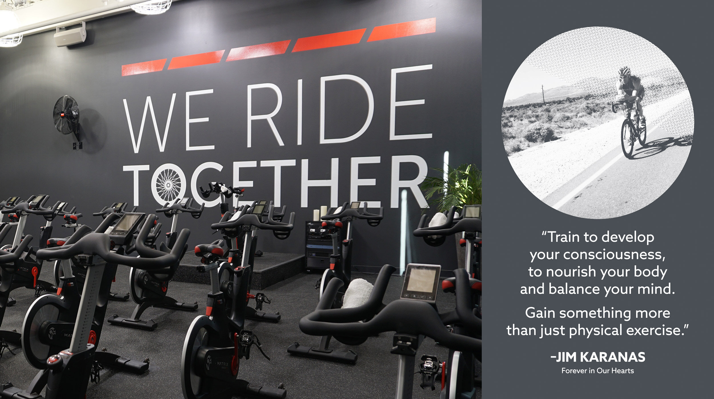
Synergy Health Club built a new indoor cycling studio called Kadence, named in honor of Jim Karanas, an influential figure in the fitness industry. I was tasked with designing the interior of the space (not including fitness equipment) on a budget.

Indoor cycling was inspired by the bicycle. Active Wellness' Visual Specialist and I created a bicycle part flatlay. We thought it would be a nice touch bringing the outdoors in–in a different way. I also designed the slim graphic on the opposite wall, as well as sourced the cement stools. (site photo 2 of 2)

Since this Silicon Valley corporate fitness center is compact in size, I designed a scenic background to make the space feel more open. The mountains in the graphic are close in proximity to the fitness center location. (site photo 1 of 2)

I continued the theme of triangles and local scenery from the fitness center to this outdoor bicycle parking area. The colors were informed by the existing color coding in the parking garage.

In Seattle, WA, the bright and energizing color palette for this corporate fitness center was inspired by the Seattle Seahawks football team. The lines in the arrows were influenced by Mt. Rainier's topography. (site photo 1 of 2)

I carried the same arrows from the fitness floor to the cycling studio. The lines represent different resistance levels on the bike. (site photo 2 of 2)
